When redecorating an interior or choosing a new object for your home, the question of color almost always comes last, after material, price and size. And yet, color is often the deciding factor. A shade that doesn’t suit you, and the object stays in a drawer. The right color, and it stays for years.
Choosing the color of an everyday object isn’t a question of superficial aesthetics, it’s a question of alignment between who you are and what you let into your living space.
In this article, we propose a different approach to choosing colors: not based on trends or decorating codes, but on you, your relationship with light, nature, materials, and how you want your home to feel every day.
1. Color, a language before fashion
We live in an age where colors change with the seasons. Decorating magazines announce “sage green” in autumn, “terracotta” in spring, “duck blue” for winter. These trends have their logic, responding to collective moods and shared psychological needs. But they also have a limit: they age. An object chosen to match a trend risks looking dated three years later, whereas an object chosen to resemble you will stand the test of time effortlessly.
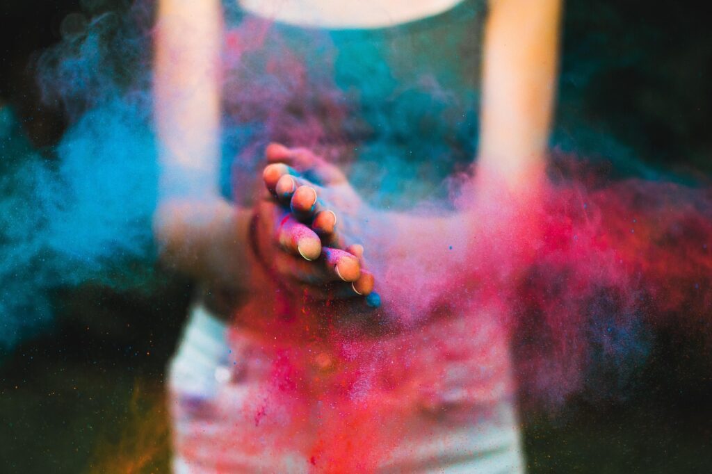
Color is first and foremost an inner language. Before being a fashion, it’s an answer to a simple question: what do I want to feel in this space? Warmth and rootedness call for earthy hues: ochre, caramel, vegetable leather, soft brown. Lightness and openness will call for light blues, pale greens and luminous grays.
The quiet vitality of a spring that’s taking hold will be recognized in an almond green, discreet but present, like a new leaf on an old branch.
Understanding this language gives us the means to choose objects that last, not only because they’re well made, but because they continue to speak to us long after we’ve bought them.
2. Color and natural materials: a special relationship

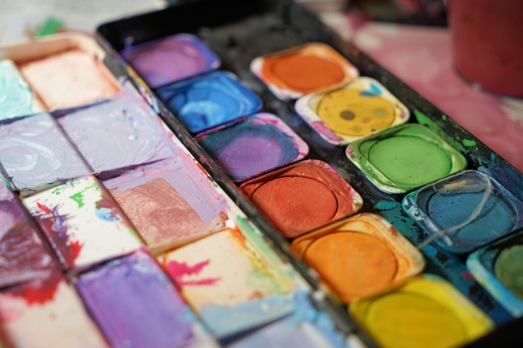
There’s a fundamental difference between the color of an industrial object and one made from natural materials. On a plastic or synthetic fabric, color covers the surface without interacting with it. On natural wool, vegetable-tanned leather or raw linen, color lives with the material. It takes on a patina, evolving slightly with light and use, developing a depth that synthetic materials cannot imitate.
That’s why choosing a color for an object made from natural materials deserves special attention. The same shade of almond green will not have the same effect on an alpaca wool throw as on a vegetable-tanned leather placemat, and that’s precisely what’s interesting. On wool, it will be soft, slightly fluffy, almost vegetable. On leather, it will have more hold, a discreet yet assertive presence.
Choosing a color from a range of natural materials means accepting that each object is unique, and that this uniqueness is a quality, not a flaw.
3. How to find the colors that really suit you
Reconnecting with nature to find your hues
The best way to find colors that suit you isn’t by browsing decorating catalogs, it’s by observing what soothes you in nature. What hues stop you in your tracks? The color of a dry stone in the midday sun, the green of an undergrowth in early spring, the deep blue of a Mediterranean sea in the late afternoon. These colors are not chosen by your intellect, they are recognized by something older within you.
It was from this observation that we built the Midipy palette. Almond green comes from spring in the south of France, the particular hue of the first leaves on almond trees, between green and yellow, neither too bright nor too muted. Mediterranean blue is that of the sea as the light begins to fade. Camel recalls the natural color of dry late-summer soil. These colors don’t seek to surprise, they seek to last.
Building chromatic coherence in your interior
A common mistake is to choose colors object by object, without thinking about the conversation they will have with each other. A camel leather storage tray, an almond green wool plaid and a Mediterranean blue leather placemat can coexist very well, if you’ve thought about the whole before choosing each piece separately.
Here are a few simple principles to build that consistency. Start by identifying a dominant hue, the one that occupies the largest surface area in your space, then choose objects in hues that respond to it without copying it. Natural materials have the advantage of being easy to match, even in different colors, because they share the same depth. A sheep’s wool throw with an almond green scalloped finish and a chocolate vegetable leather placemat won’t compete with each other, they’ll complement each other, like two elements of the same landscape.
Also consider the light in your space. A north-facing room will call for warm hues to compensate for the absence of direct sunlight. A room bathed in southern light will welcome cooler hues without appearing cold. The color of an object is never fixed: it changes according to the time of day and the season.
4. The durability of choice: why some colors stand the test of time
Choosing a responsible color
As part of a responsible approach to consumption, the choice of color also has an ethical dimension. Some synthetic dyes use intensive chemical processes, with little respect for the environment and the craftsmen who handle them. Choosing objects whose hues are close to the natural color of the material is a gesture in line with your values.
At Midipy, we’ve chosen to work with materials whose colors are first and foremost those of nature itself. Our wool plaids take their hues directly from raw wool: the ivory white of white sheep, the chocolate brown of black sheep, the mottled grey of a mixture of the two. No dyes, just the color of the animal’s down, in all its natural diversity.
For our leather objects, we work exclusively with vegetable-tanned leather, an ancient process, slower than chemical tanning, which respects the natural structure of the leather and allows it to develop a patina over time. The colors we apply are chosen for their stability and ability to age gracefully.
Fantasy enters by a different route: the colorful finishes on our plaids are handmade, with a dyed thread highlighting the edges and adding that special touch of character to each piece. It’s on this discreet, handmade, carefully chosen detail, and the matching leather strap that accompanies it, that color becomes signature.
Colors that age well
Some colors don’t age well, they fade, turn yellow and eventually wear out. And there are others that, over time, become more beautiful.
Vegetable-tanned leather, for example, develops a patina with use that did not exist when it was purchased, an extra depth that means a well-cared-for object is often more beautiful ten years on than it was on day one. This is what we call an object’s character. In the same way, an undyed natural wool plaid retains a timeless beauty precisely because its color is that of the material itself, and can neither fade nor disappoint. Choosing a color that ages well means choosing an object for the long term, not for the season.
5. Integrating color into an everyday philosophy
We believe that the objects that surround us every day contribute to our inner balance. Not in a spectacular way, but by their discreet presence, by the coherence they create in our space, by the simple pleasure they bring with each use.
A leather placemat placed on a wooden table, a woollen plaid folded on an armchair, a pocket organizer in a hallway: these objects build, without us always realizing it, an interior home that resembles us.
Choosing their color with care means extending this intention. It means deciding that what enters our space has been chosen, thought out and desired, rather than suffered or bought by default. It’s a form of slow consumption applied to intimacy.
If you’d like to explore the colors available in the Midipy collection, from almond green to Mediterranean blue, camel to chocolate, we invite you to discover our objects handcrafted in France, in natural materials chosen for their durability and beauty.
In conclusion, the color of an object is not a detail, it’s a decision. The decision to trust ourselves, to listen to what we feel rather than what we’re told we want, and to choose objects that will continue to speak to us ten years from now as they did on the first day. In a world that changes fast and produces a lot, there’s something profoundly radical and profoundly sweet about choosing slowly, and choosing well.
Inspiration
We loveAlicia Martinez ‘s take on color in interiors. Her Instagram account @alichuree is a generous source of inspiration, to be discovered without moderation.
